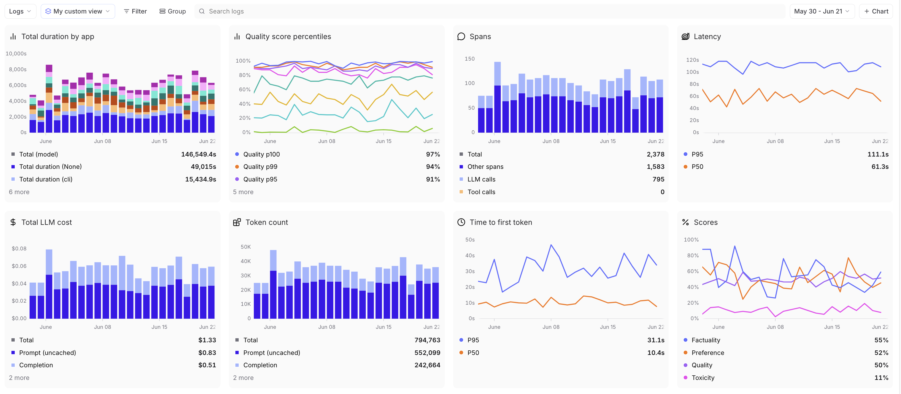
The page provides dashboards that aggregate metrics across logs and experiments in your project. Track request counts, latency, token usage, costs, scores, topics, and custom metrics over time. Each dashboard configuration is saved as a view — use the menu to switch between views or create custom ones.Documentation Index
Fetch the complete documentation index at: https://braintrust.dev/docs/llms.txt
Use this file to discover all available pages before exploring further.
Filter and group data
Apply filters and groupings at the top of the page to affect all charts. This lets you focus on specific subsets of your data or compare different segments side by side. Filters apply to entire traces with any span match, while groups are only per span.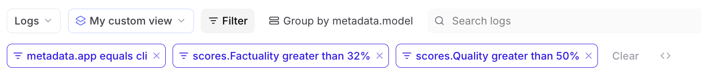
Select timeframes
Choose from preset timeframes or click and drag horizontally on time series charts to zoom into a specific period. Double-click to zoom out.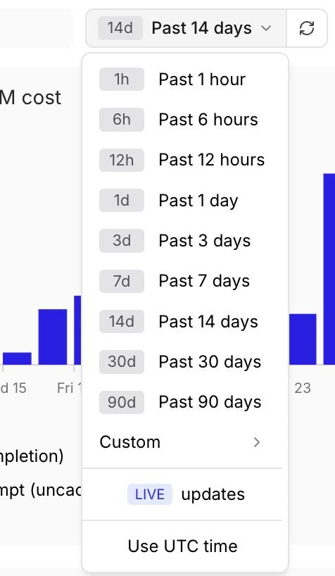
View traces
Select any data point on a chart to navigate to the logs or experiments page, filtered to the corresponding time range and series. This lets you quickly investigate specific data points.Create custom charts
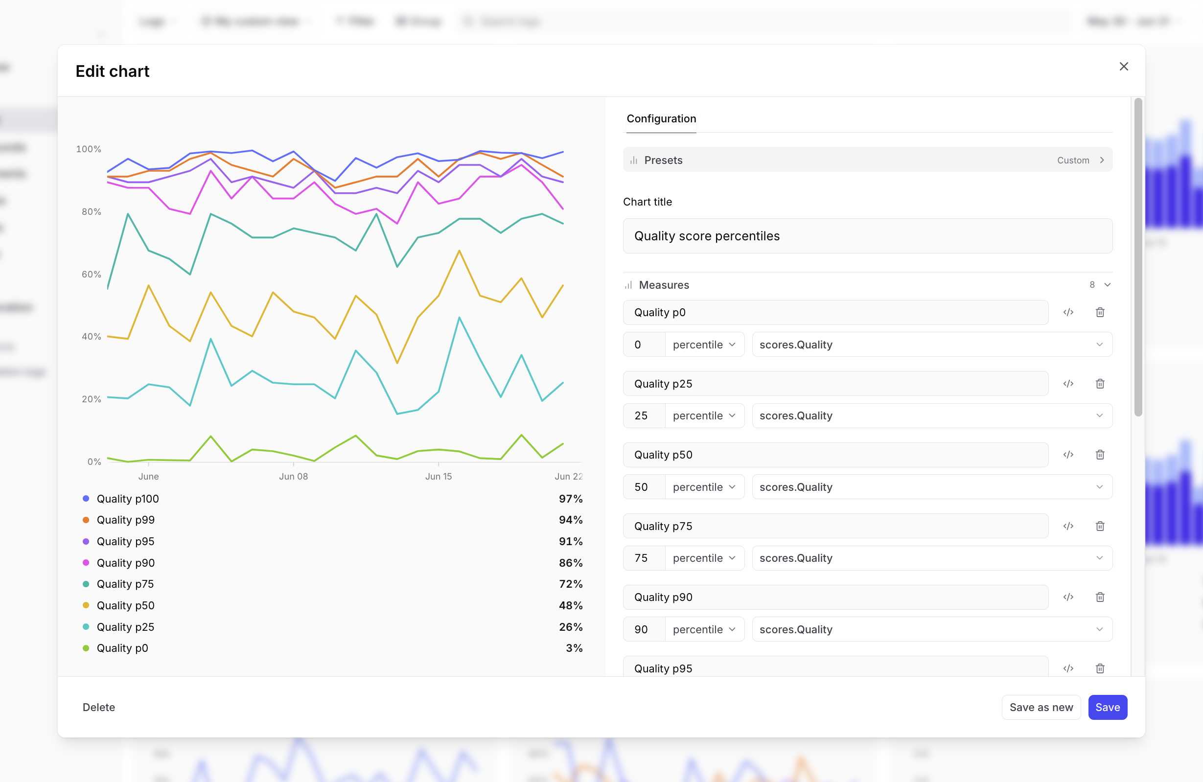
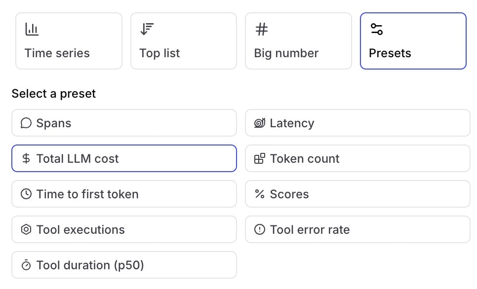
Select + Chart to open the chart editor, or select the icon on any chart to customize it. The editor exposes the following options:- Chart type: Determines the visualization and which other options are available:
-
Time series: Plot metrics over time as lines or stacked bars. Time series charts help you spot trends, anomalies, and correlations.
Show screenshot
-
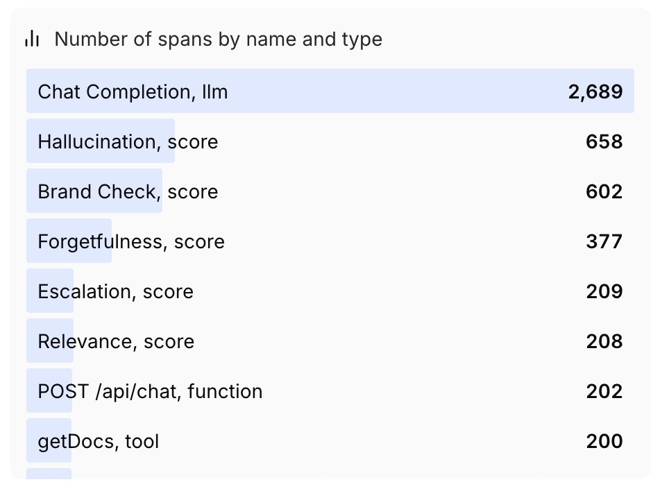
Top list: Rank groups by a metric over the selected timeframe. Order by value or alphabetically (ascending or descending).
Show screenshot
-
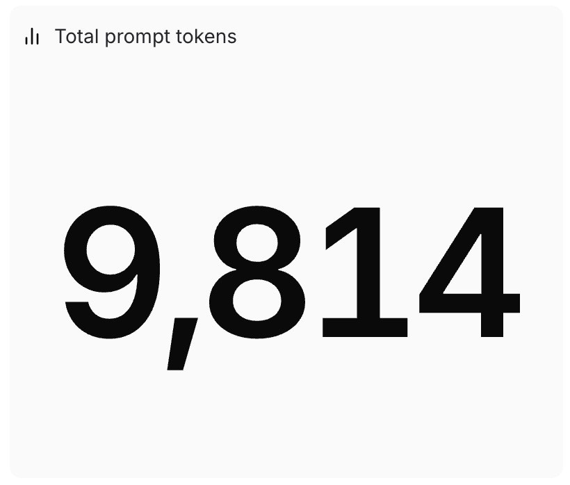
Big number: Display a single aggregate value as one large number. Useful for highlighting key metrics like total requests or average score.
Show screenshot
-
Presets: Start from a built-in chart covering common metrics like request count, latency, token usage, and scores.
Show screenshot
 Some preset charts (Spans, Latency, Total LLM cost, Token count, and Time to first token) automatically exclude internal scorer spans generated by online scoring automations such as Topics and online scorers. This ensures the metrics reflect actual production traffic rather than scoring overhead. Custom charts include all spans by default — add a
span_attributes.purpose is null or span_attributes.purpose != 'scorer'filter to replicate the same behavior.
-
Time series: Plot metrics over time as lines or stacked bars. Time series charts help you spot trends, anomalies, and correlations.
- Title: A label displayed above the chart.
- Measures: What to plot. Select a SQL expression and aggregator (sum, avg, min, max, count, count distinct, or percentile), or click
</>to enter a full SQL aggregate expression such asavg(latency) / count_distinct(user_id)or100 * sum(errors) / count(id). Invalid expressions display a validation error on hover. Built-in measure types are also available for aggregate scores and cost. - Trace filters: Narrow results to traces where any span satisfies the filter conditions. Useful for filtering by root-span metadata (e.g.
metadata.email). - Span filters: Narrows results to individual spans that satisfy the filter conditions. Only matching spans contribute to the measure.
- Group by: Splits the chart into separate series by a SQL dimension (e.g.
metadata.model). Available for time series and top list charts. - Options: Controls visualization-specific settings:
- Unit type: Choose how values appear in chart axes, tooltips, and legends:
- Duration: Seconds (e.g., “1.5s”, “0.3s”)
- Cost: US dollars (e.g., “1.23”)
- Count: Generic countable things (e.g., “1,234”, “5.5”)
- Percent: Percentages (e.g., “75%”, “100%”)
- Bytes: Binary byte units using base-1024 (e.g., “1 KB”, “2 GB”, “500 B”)
- Visualization: Visualize as lines or bars. Available for time series charts only.
- Sort: Sort by value or name, ascending or descending. Available for top list charts only.
- Unit type: Choose how values appear in chart axes, tooltips, and legends:
only available on Pro and Enterprise plans.
Manage custom charts
Export charts
Hover over a chart and select Export chart to open a submenu with the following options:- Add to another view: Copy the chart to a different Monitor view in the same project or another project.
- Copy config: Copy the chart’s configuration to your clipboard. Paste it on any Monitor view to add the chart there.
- Open in SQL sandbox: Open the chart’s underlying query in the SQL sandbox for further exploration.
Export data
Hover over a chart and select Export data to open a submenu for copying or downloading the chart’s underlying data:- Copy JSON / Raw JSON: Copy the data as JSON, or open it in a new browser tab.
- Copy CSV / Raw CSV: Copy the data as CSV, or open it in a new browser tab.
Duplicate charts
Hover over a chart and select Duplicate to add an identical copy of the chart to the current view.Delete charts
Hover over a chart and select Delete to remove the chart from the current view. Charts can only be deleted from custom views, not from the built-in “All data” view.Create custom views
The built-in “All data” view shows all data for your project. To create a custom view, you can either:- Edit a chart on the built-in view: When you add or edit a chart on the “All data” view, the editor will prompt you to name and save a new view before your changes are applied.
- Duplicate the current view: Use the menu in the top left to duplicate the current view and save it as a new view.
Creating and editing custom views requires the Projects > Update permission in your organization’s permission groups. Project-level permissions are not sufficient because views are scoped to the organization, not individual projects.
Duplicate views across projects
If you’ve built a useful view in one project, you can duplicate it to another project rather than recreating it from scratch.- UI
- API
- Go to the page in your source project.
- Select the view you want to duplicate from the menu.
- Open the menu in the page header and choose Export view config to download a JSON file or Copy view config to copy the configuration to your clipboard.
- Go to the page in your destination project.
- Open the menu and choose Import view config to upload the JSON file, or paste the copied configuration anywhere on the page using your keyboard.
- On a custom view, pasting replaces that view’s charts, filters, and settings.
- On the built-in “All data” view, you are prompted to create a new custom view from the pasted configuration.
Set a default view
You can set a default view at two levels:- Organization default: Visible to all members when they open the Monitor page. To set an organization default, you need the Manage settings organization permission (included by default in the Owner role). See Access control for details.
- Personal default: Overrides the organization default for you only. Personal defaults are stored in your browser, so they do not carry over across devices or browsers.
- Switch to the view you want by selecting it from the menu in the top left.
- Open the menu again and hover over the currently selected view to reveal its submenu.
- Choose Set as personal default view or Set as organization default view.
- Open the menu and hover over the currently selected view to reveal its submenu.
- Choose Clear personal default view or Clear organization default view.
Next steps
- Use the Loop to ask questions about your data
- Score online to add quality metrics to dashboards
- Build datasets from patterns you identify
- Read the SQL reference for advanced queries